
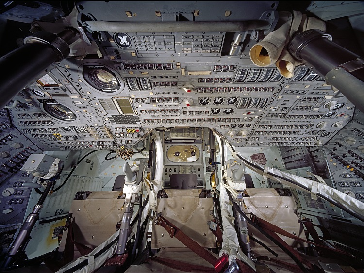
Take a look at the picture above and try to imagine how long it took the astronauts to learn the position and function of every button on there. The picture is of the interior of Apollo 11’s Command Module “Columbia” . Photographer Eric Long, Courtesy of the Smithsonian’s National Air and Space Museum
I am not an expert when it comes to HMI programming (Human Machine Interface) but I have an average amount of experience with it and one thing in particular drives me up the walls. It doesn’t matter if its the front-end of a computer program or a CNC machine or the dashboard of a car (I will use HMI as an alias for all of these interfaces further down in the text), when I can’t find the setting or function I’m after I get extremely annoyed. And then comes the whole dance of searching online, and looking in the manual, and finally finding what you want just to realize that it was in a completely illogical place to begin with.
For those of you that don’t feel like reading the whole text there’s cheat sheet at the end of the article and if you want to know more about my background go here.
Why am I thinking about this?
I’m going to make a weird analogy here but bear with me. For a couple of years I trained Krav Maga. If you who don’t know, Krav Maga is a martial art developed and practised by the Israeli armed forces. It is relatively young, it is only 50 years or so, and it was developed with intuitiveness in mind. The idea was to blend the most intuitive and effective moves from traditional martial arts, all the moves that most closely resembled your own reflexes, and make them easy to teach to the masses of infantry men/women.
These are exactly the same qualities we are looking for when developing an HMI. The average operator of a machine or user of a software, at least the more common softwares, won’t be interested In picking up a textbook or taking a class simply to “push a button”. So we have to place the “button” where the person expects it to be or at least where it is most needed and easy to remember.
Lean mentality
An HMI should only contain what is needed, when it is needed. And before you place a button or function on the screen you should evaluate the need and position of the object. It might be a good idea to rank all the buttons that are needed for normal operation and then place them according to the rank. The buttons used most often should be at the front, or top, and the more seldom a button is used the further away from the user you can place it. Just make sure the menus make sense, because we still want the user to be able to find the function if they need to. Don’t be afraid to get some input from your friends or colleagues here, there is a good chance that something you think is obvious will be mystery to someone else, especially someone that haven’t programmed your HMI.
The hive mind
What’s interesting in all of this is that some of the largest software companies in the world are responsible for this, indeed the ones that should have had this all sorted out long ago are still making the same basic mistakes. I think Microsoft Office is a prime example of this, there are few programs I have raged more over than Microsoft Word in this regard.
I think the problem here is partly due to a small sample size. I don’t know exactly how Microsoft run their software projects but I would bet money on that they work in core groups of between 10-30, because that size is easily manageable and you see the same size everywhere in industry. After that comes beta testing, which I’m definitely hoping is quite extensive and has a group of people with varying back grounds. And even so they fail repeatedly because a few hundred people, is nothing compared to the potential thousands that will be using the program.
Open Source software on the other hand has one distinct advantage here, and that is larger sample size.
I looked up some basic data and the largest most successful projects have several thousand active contributors. For example Mozilla Firefox has 1400 contributors and the Linux Kernel has more than 4000! (Source:OpenHub ). And my office suite of choice, Libre Office, has 200+ contributors. I might be a bit biased here because I like the idea of Open Source, but I think that these programs are a lot more intuitive than their Microsoft counterparts.
Most of you won’t program HMI:s that will be used by thousands of people but it should serve as an example to harness the power of the hive mind, so ask your colleagues for their opinion.
Graphics for HMI:s
Graphics have become an issue in the last 15 years or so because with increased computing power, graphic intensive applications are not as much of a problem for the hardware any more. It is however a problem when it comes to the usefulness of an HMI. Humans are on average easily distracted and if the graphics are to garish it will draw attention away from the controls, you can’t see the forest for all the trees basically. HMI:s should be fairly dull in their appearance to be really useful.
Having the same basic layout for all the screens is also essential for a well functioning HMI. If your application have 10 pages the end user can either have to learn to navigate 10 different layouts or 1, now which one do you think is quicker and more intuitive?
Cheat Sheet for programming HMI:s
Here is the list in no particular order, all of these are equally important and should be considered when designing a graphical user interface or HMI.
- If a function is not necessary it should not be there.
- The functions most often used should be the easiest to access and most clearly marked.
- The menus should make sense, imagine never having seen it before and trying to find something.
- Use size to your advantage, the more often used, the bigger the button.
- No unnecessary animations, it distracts the user.
- Think about the colours, make sure you have good contrast for the buttons/functions and it shouldn’t’ look like a clown puked on the screen.
- Repetition is king, if the HMI has multiple screens they should all have the same basic layout, buttons should be the same style, use the same colours etc.
- Don’t trust your own judgement, you’re biased, ask friends or colleagues for their views.
- Integrate help functions if possible, text-box pop-ups with explanations when you hover over buttons for example. Have good documentation and an easy to read manual if not.
- Don’t invent your own icons, the save icon is a floppy disk for a reason, everyone recognizes it.
- Group similar actions together, all service functions should be on the service tab and all the preferences should be grouped under preferences in the menu for example.
Conclusion
These are my views when it comes to HMI:s and other user interfaces, it doesn’t matter if it’s a graphical or even mechanical interface. You know the old school ones with a thousand buttons and analog meters everywhere. The same rules apply in all cases.
Till next time.